
Custom Signal Quality Dashboards
Interactive, web-based analytics tailored to your facility. Visualize coverage, compare carriers, and track DAS compliance—all from a secure client portal.
Dashboard Features
Purpose-built analytics tools to make your signal data actionable.
Visualize signal strength across your facility with color-coded maps you can zoom, pan, and filter by carrier or metric.
Track signal quality over time and across locations with detailed line and bar charts.
Side-by-side carrier performance analysis showing which networks perform best in each area.
Identify which cell towers and sectors serve each area of your building for DAS planning.
Automatic scoring against industry thresholds (-85 dBm RSRP, -10 dB SINR) with pass/fail indicators.
Generate PDF reports and CSV data exports for stakeholder presentations and RFP documentation.
Dashboard in Action
See how your signal data comes to life with interactive visualizations and detailed analytics.
2,624 readings • 48 scans • February 17, 2026
Carriers Detected
4
AT&T, Verizon, T-Mobile, Dish
Avg Signal (RSRP)
-89 dBm
Range: -117 to -62 dBm
Signal Quality (RSRQ)
-11.2 dB
Best: -4 dB
Signal-to-Noise (SINR)
8.4 dB
1,247 serving cell samples
Weak Coverage Areas
34%
892 of 2,624 below -110 dBm
Cell Towers Detected
18
2,624 total measurements
AT&T
-84 dBm
812 measurements
Verizon
-91 dBm
756 measurements
T-Mobile
-87 dBm
689 measurements
Dish
-102 dBm
367 measurements
Average RSRP across all test points. Red dashed line = -110 dBm indoor threshold.
Live preview built with real dashboard components and sample survey data.
How It Works
From survey to dashboard in three straightforward steps.
We Survey Your Facility
Our technicians collect comprehensive RF measurements across your entire building.
We Build Your Dashboard
Survey data is processed into interactive visualizations tailored to your needs.
You Access It Anytime
Log in from any device to view, analyze, and export your coverage data.
Security & Access
Your data is protected with enterprise-grade security at every level.
Secure client login with unique credentials
Role-based access for team members and consultants
Data encryption in transit and at rest
Your data, your control—export anytime
Free Mileage Dashboard for Drivers
Every Cell Surveys app user gets a free web dashboard to track trips, view mileage history, and export data for tax time.
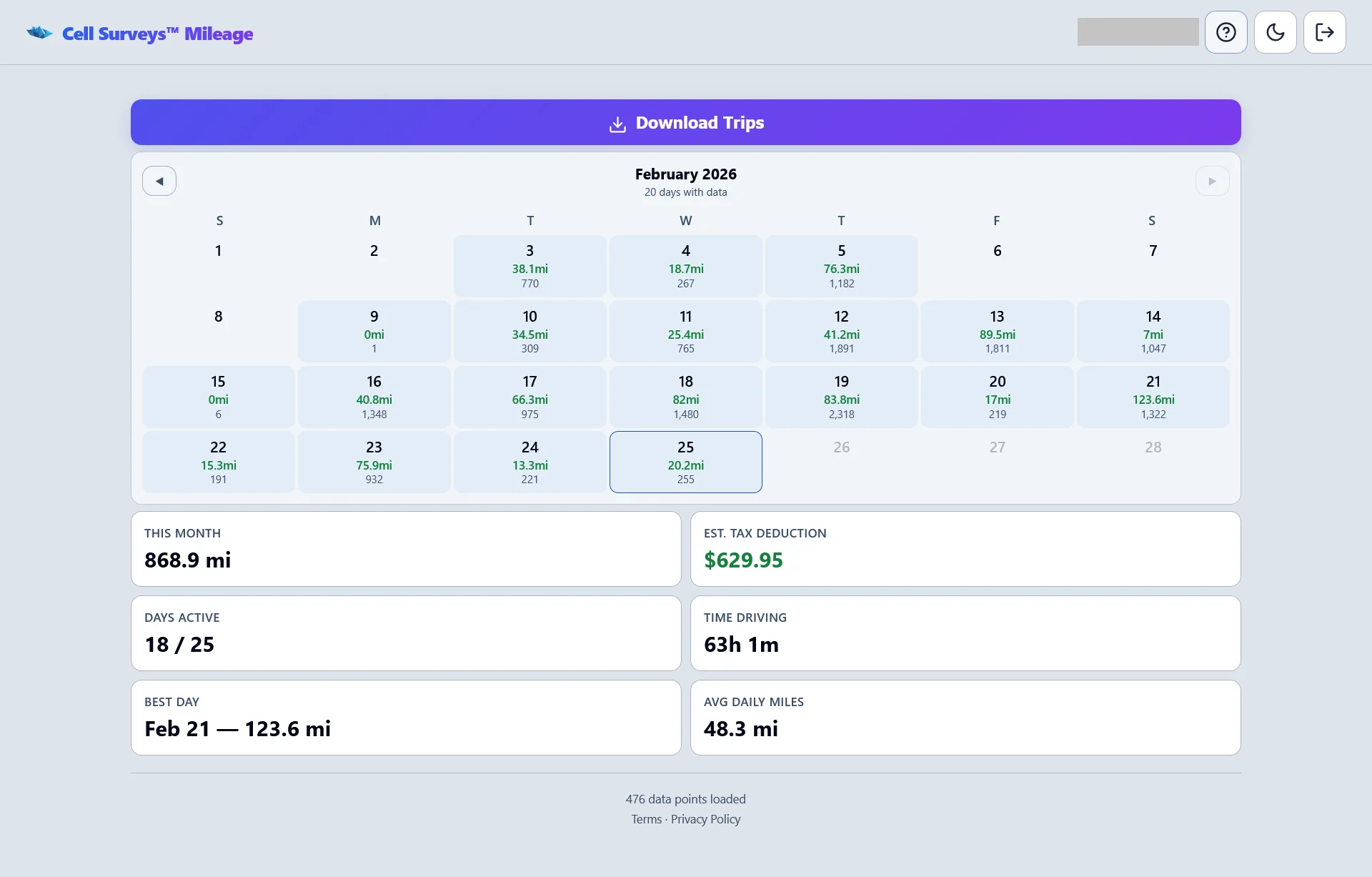
Monthly calendar with trip counts, mileage totals, and tax deduction estimates
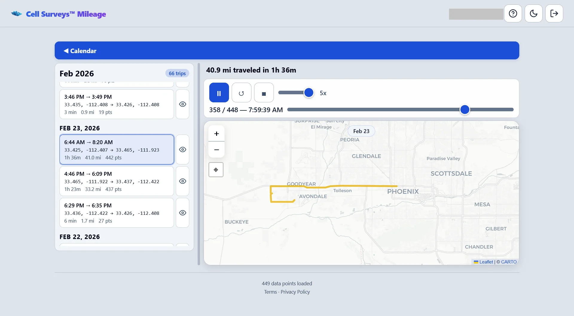
Trip list with route replay on an interactive map
- Automatic trip logging from the app
- Monthly calendar with daily summaries
- Tax deduction estimates (IRS mileage rate)
- CSV export for tax records
- Route replay with interactive maps
What Is Actually in the Deliverable
A dashboard is only useful if you can get the underlying numbers back out of it. Here is exactly what you receive and what it contains.
Every reading is kept, not averaged away
A survey produces thousands of individual measurements. Some reporting tools collapse those into a single average per floor, which is the one summary that cannot tell you anything useful — a floor averaging −95 dBm might be uniformly mediocre or might be excellent everywhere except the stairwell where your fire alarm panel lives. We keep each reading with its own GPS position, altitude, timestamp, serving carrier, PCI and network technology, and the dashboard aggregates on top of that rather than in place of it. When a number on a heatmap looks wrong, you can drill into the individual samples behind it.
The CSV export is the whole dataset
Export produces one row per measurement, not a summary table. Each row carries latitude, longitude, altitude, timestamp, carrier, network technology, RSRP, RSRQ, SINR, RSSI, PCI and the serving cell identifier. That is deliberately the same data our own dashboard reads from, so an RF engineer on your side or your integrator's side can reproduce every chart we show you, or load it into their own propagation and design tools. Nothing about the analysis is a black box you have to take on faith.
Before and after live in the same view
When a DAS or ERRCS system is commissioned, we re-survey the same grid and load the new pass alongside the original baseline rather than replacing it. The dashboard then shows both, so the conversation with your integrator moves from “it feels better” to a measured delta per floor, per carrier, at the specific points that failed the first time. This is also what an AHJ wants to see for public-safety acceptance: the same locations, measured the same way, before and after.
Built for three different readers
The same survey has to satisfy people who want very different things from it. A building owner wants one page that says whether there is a problem and roughly what it will take to fix. An integrator wants the raw grid and the donor-signal readings so they can size a system. An AHJ or fire marshal wants the public-safety bands and DAQ scoring against the adopted code, and nothing else. Access is role-based, so each of them gets the view that answers their question instead of a single PDF that half-answers all three.
If you want to know how to interpret what you are looking at once the dashboard is live, the dashboard reading guide walks through the metrics one at a time.
Related Resources
Learn more about signal surveys and dashboard analytics.
How to Read a Signal Survey Dashboard
A facility manager's guide to understanding key RF metrics, heatmaps, and compliance scores.
What Is a DAS Signal Survey?
Everything you need to know about professional signal surveys and how they inform DAS design.
Onsite Signal Surveys
Professional RF measurements for DAS RFPs, coverage validation, and multi-carrier benchmarking.
Dashboard FAQ
Can I share my dashboard with my team?
How long do I have access to my dashboard?
Can the dashboard be updated with new survey data?
What formats can I export data in?
Get a Custom Dashboard
See your signal data come to life with an interactive dashboard built for your facility.